Screen Design
The screen design for the user interface of the software application was aimed to be minimalistic and simplistic, allowing for intuitive, smooth navigation throughout it, allowing users which may not be familiar with computer programs to quickly learn its functions. As the program will be used within a fast-paced environment, controls were suitably placed throughout the screens, as well as being grouped together based on their functions.
The dark theme utilised within the application was inspired by the voice and chat application, Discord. In order to not confuse new users, information regarding navigation was placed throughout the program hence allowing them to quickly familiarise themselves. Gradients and 3D effects were omitted as they were deemed extremely “flashy” and unsuitable for the purpose of the application. Squared buttons and text boxes were used to emphasise a “flat” minimalistic but familiar design. This is coupled with the soft colours of the theme to create a to-the-point type of program, whilst not isolating the user. Controls with same functions were grouped together in order to reduce the clutter around the screen and prevent any confusion of what each control does.
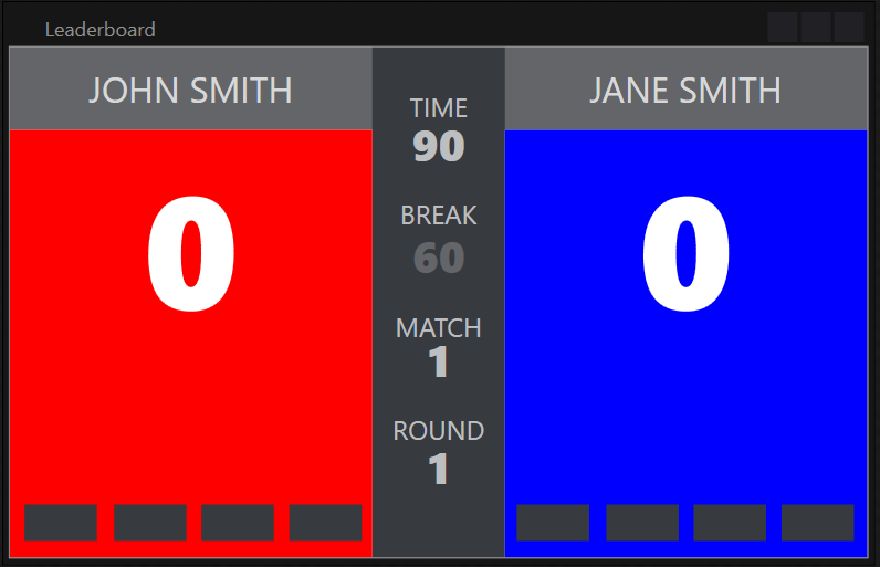
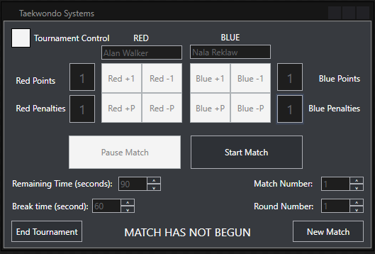
Navigation throughout the program was made user-friendly by coupling images relating to the text, enabling intuitive navigation throughout the entire program. Button sizes were increased streamlining the navigation and text boxes were also enlarged to allow for clearer presentation. The controls within the tournament control were especially enlarged accounting for the fact that it will be used in a fast-paced environment in which accurately pressing buttons may not be possible.
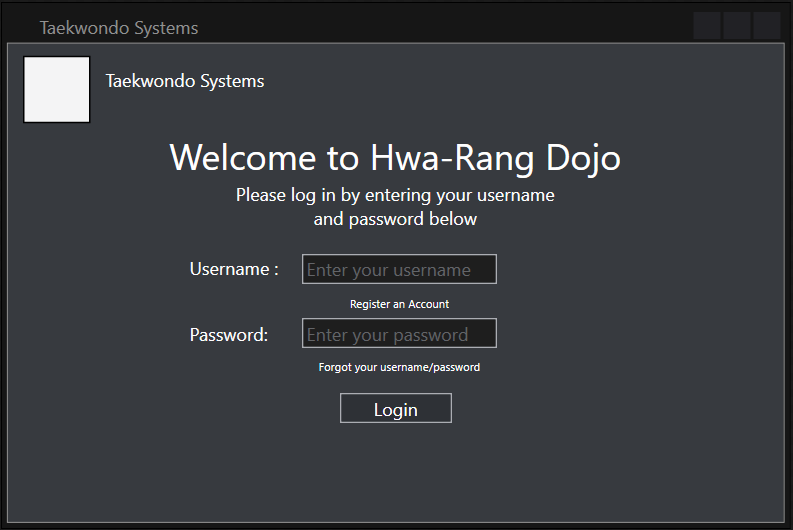
Login
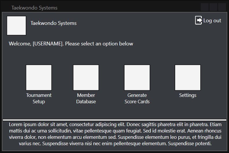
Main
Attendance
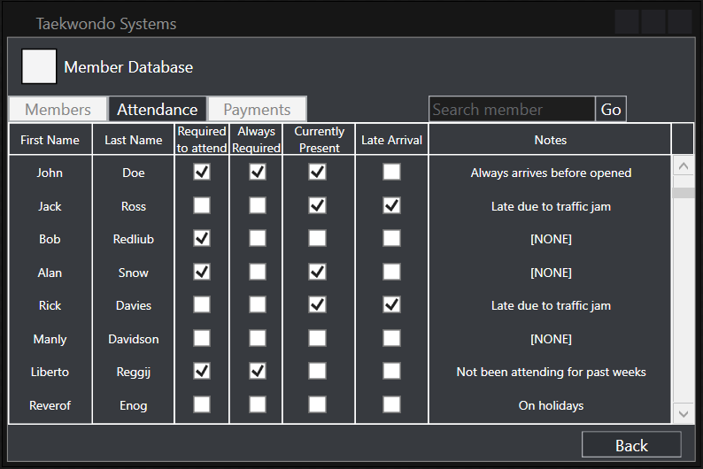
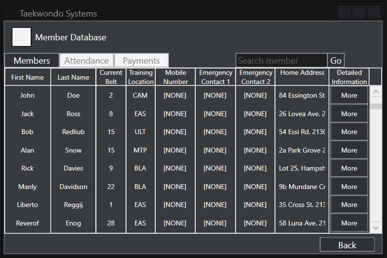
Members
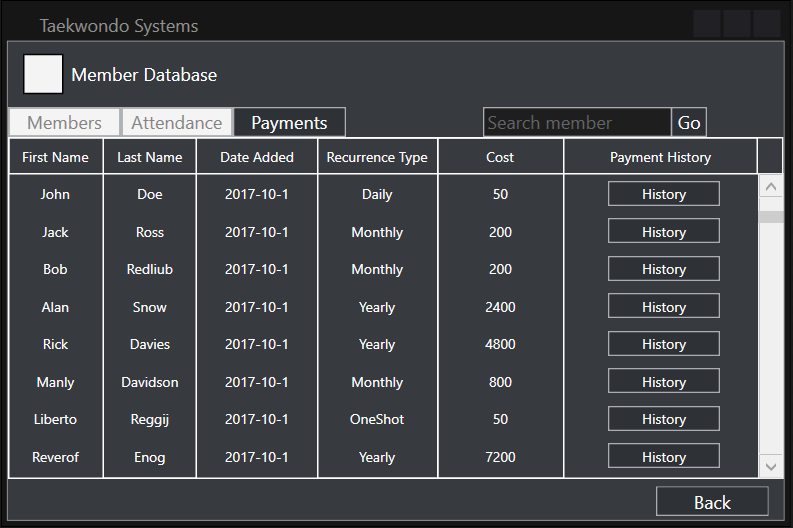
Payment
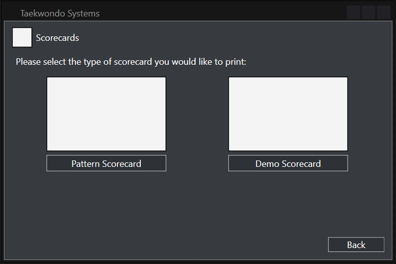
Scorecards
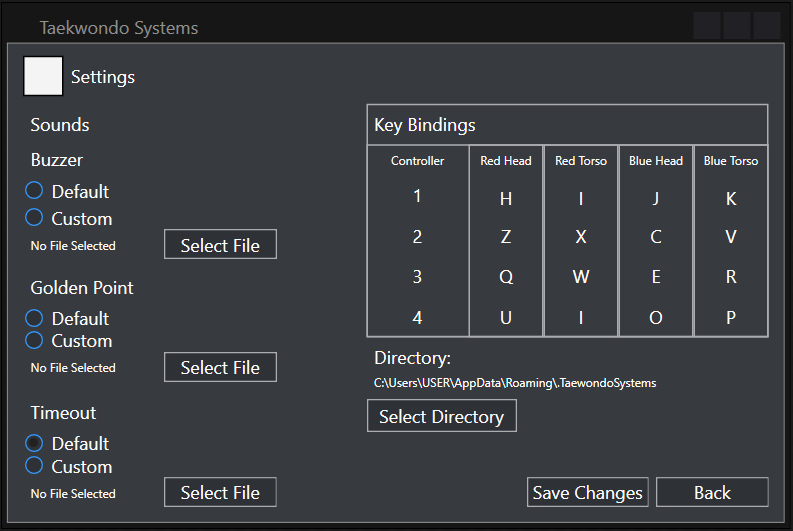
Settings
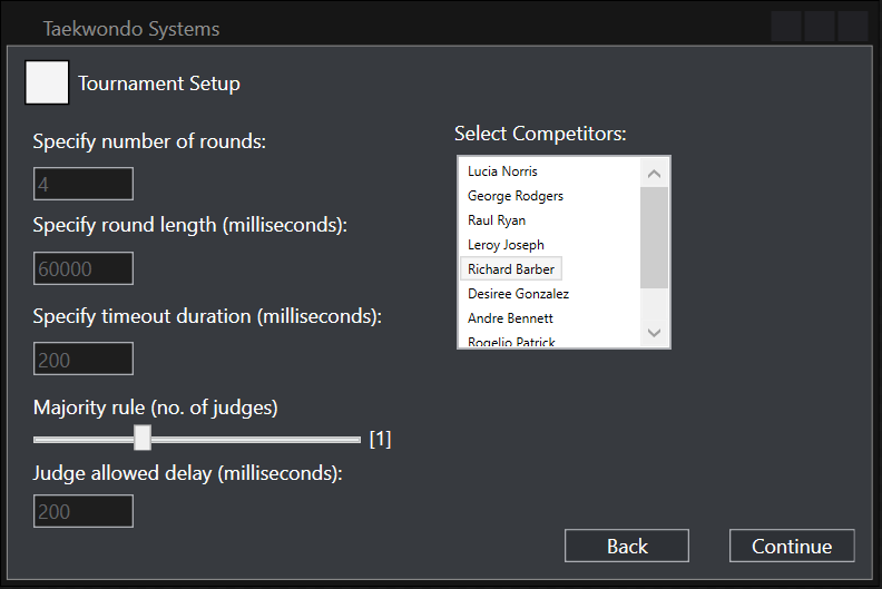
Tournament Setup
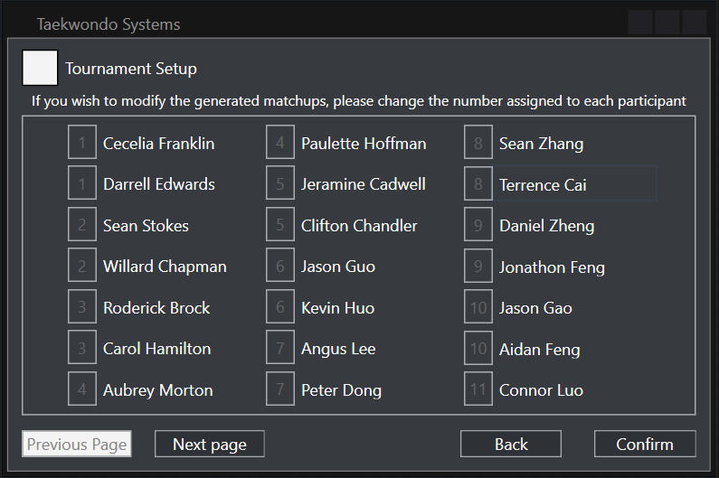
Bracket Customization
Tournament Control
Scoreboard